As many of you know, we are in the process of developing a new look for the Cancer Center – including a new website, a redesign of Lombardi Magazine, and a new logo. Over 120 of our faculty and staff participated in a recent survey about two logo designs that we are considering. We also sent the survey out to donors, patients, and friends/family of patients.
So first, thank you to all who responded to our email survey.
I’d like to share with you the two top designs, to make sure everyone has an opportunity to give us feedback. I invite everyone to leave a comment here and let us know what you think.
Based on the feedback from the survey (over 24 pages of comments!) and your thoughts here, we will work to revise the the most popular design into the final logo.
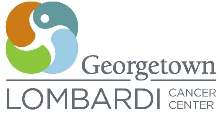
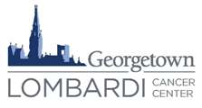
Logo descriptions
Bubble: Lombardi operates under the banner of Cura Personalis, a latin phrase that means care of the whole person. Four missions-research, treatment, education, and community-complete the vision of care and research at Lombardi.
The person-the patient, the researcher, the caregiver-is at the center of everything Lombardi does; it is the individual who inspires and it is the individual who makes the difference. The way the figure is portrayed suggests a forward circular movement, paralleling translational research-from bench to bedside, and back. All new ideas move from the researcher to the patient, and ultimately transform the standard of care around the world.
The overlapping circular shapes in this graphic also suggest a microsopic cluster of cells. This, when combined with the human figure, provides a relevant statement about the impact of scientific research on our well-being.
Skyline:The Georgetown University skyline reinforces the reputation and quality of work at Lombardi. The gothic skyline, recognizable to many in the Washington, DC area, conveys a strong sense of location, history, and excellence. Closely tying the cancer center to its academic roots, the logo reinforces the relationship with Georgetown University and provides recognition beyond simply the Lombardi name.
This is an image Lombardi has used in the past, such as the 2006 Annual Report, as well as this blog.
9 replies on “A New Logo for Lombardi”
Dear Lou,
I thought it is a good idea to debate on the Lombardi logo issue on your blog site and I would appreciate it if you could include my opinion.
Personally, I think it does not serve its objective by developing an”eye-catching” logo for Lombardi for the following reasons:
1. many cases, the artists’ divine intention will not be apparent to or recognized by the most (eg the bubble version of the logo and the medstar logo?)
2. we encounter so many logos everywhere that one would not remember it and
it is unlikely that an abstract logo can make an instant click with its brand. Unless you have a huge/constant exposure like Nike or AT&T.
3. If you look around, most of the brands around us simply have their own brand names stylized as their logos (I guess for the aforementioned reasons), eg GM, SONY, DELL etc
I personally support the skyline logo because:
1. The essential words are spelled out: Lombardi, Georgetown and Cancer, and Lombardi stands out.
2. The familiar Georgetown logo will make an instant association of Georgetown University and Lombardi (it shows Lombardi is a part of the community, the University and the region).
3. It matches better with the University logo (emblem) in case they are shown side-by-side
And one last reason: the efforts is better directed towards exposing it eg print it on T-shirts for the event staff etc.
Regards,
York
Agreed. Never liked the amorphous-fishy-bubble thing.
Made no connection to/with LCC/GUMC.
Go with the skyline.
P.S.
IMHO, Cura personalis is more-or less meaningless,since unless I misunderstand something, cure (or at least no harm) is the basis of all medicine, practiced everywhere.
In fact, if you take out the thee’s and thy’s etc, The Oath of Maimonides pretty much spells it out..
Making up some pseudo latin phrase does not really distinguish us from any where else..
The NAME does, and that is what people look for.
I may be wrong, but I doubt it…..
Cheers
Chip
My vote is for the skyline logo as well. It looks a bit more mature and distinguished, and the colors used for the buildings associate it more with Georgetown University than the bubble logo. The skyline logo promotes more of a “legacy of excellence” feeling than the bubble logo which you may find yourself having to change in a few years due to the times/trends. The skyline logo is more “brand-able,” and I could see it being used thirty years from now to promote Lombardi. Can’t say the same thing about the bubble logo.
I will go for the bubble logo. Cancer Research & Cure are two integrated concepts.
In my view we are not promoting Georgetown although Georgetown and Lombardi Cancer Center are inseparable.
Our Logo should be able to represent what we strive to do for humankind.
It is the translation of research from Bench to Bed side and so back on.
It is a process …….. committed to succeed the combat against cancer that’s what Lombardi stands for.
It’s just matter of personal preference. …
Thanks
Anju
I think the georgetown skyline logo looks impressive. The Gothic structure gives a sense of something tangible, traditional and secure. Besides, it represents all our university and medical center services.
The skyline if used should have the 2 towers as we all know the Healy bldg.. The new one does not depict the GTU skyline adequately.
The Bubbles are not savvy enough. Without the words one would not get the meaning.
Of the two, I prefer the skyline, but it seems to me there could be a better logo – one that combines the more attractive colors of the skyline image, but one that also communicates a cutting edge, modern techonology, merging our mind, body, soul approach to medicine. I like the ideas behind the meaning of the new logo, it just doesn’t successfully communicate them.
Perhaps the pediatric art program can do a logo contest and we can vote on multiple options.
Becky
Thank you to everyone for your very thoughtful responses to the survey and the blog post about our new logo candidates. We are taking all of the feedback into consideration as we move forward in collaboration with the University on our branding initiative.
One of the comments that came up several times was the removal of the word “comprehensive” from the logo. Many of you indicated in the survey that you were concerned by its removal from the logo because it is a matter of great pride. Our comprehensive designation is indeed reflective of the excellence of all of our faculty and staff, and we are working on new versions.
Thank you again!
Also, the bubble logo looks somewhat similar to the logo for Suburban Hospital.